

Alphabet Book (Calligraphy Sample Book)
In German, decorated manuscript on paper
Germany, c. 1780-1800
TM 1121
sold
34 folios on paper, no watermark, modern foliation in top recto corners, f. 24v is now glued to the verso of f. 24 out of order, f. 18 also bound out of order, lacking at least two leaves, and possibly three: one leaf with ‘R’ in the first series, and one leaf at the end with ‘Y/Z’ in the second, possibly also missing one leaf with ‘U’ in the first series, although it may have been skipped intentionally, bound in a single quire (original collation uncertain due to restoration), graphite ruling with differing number of lines per folio (justification varied), written by a single scribe on the recto (leaving the verso blank) with first line of each folio, ff. 1-24v, in a fraktur display script, usually colored, second line in Kanzleischrift (first line ff. 25-34), and remainder of text in Kurrentschrift, calligraphy scrolls in margins throughout, all folios with one or two large scrolled calligraphic initials in pink, green, blue, yellow and/or black, most on a decorative background of curlicues and some with flowers (ff. 3, 18, 20, 26, 29, and 34) and/or figures (horse heads on ff. 26 and 27; birds on ff. 30, 31, and 32; suns with faces on ff. 31 and 32; and a dog on f. 32), foxing on all folios, darkening and staining of first and last folio, burn-through of green ink resulting in some holes in initials on ff. 3, 6, 12, and 17, chipping and discoloration around edges and most pronounced at bottom 10-15mm with some disruption or loss of final text line on ff. 9, 18, 23, 25-27, 30, and 31, pest damage to final two text lines of ff. 32-34, modern paper restorations on verso of ff. 1, 2, 16, 18, 19 27, 29-34 and at inner margin of ff. 1-4, 17, 18, and 24 with partial loss of initials on f. 18, condition overall worn but fair. Unbound but tacketed with twine, now loose, outer folio reenforced with modern paper at fold. Dimensions 165 x 215 mm.
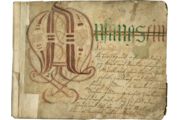
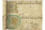
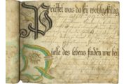
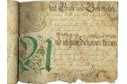
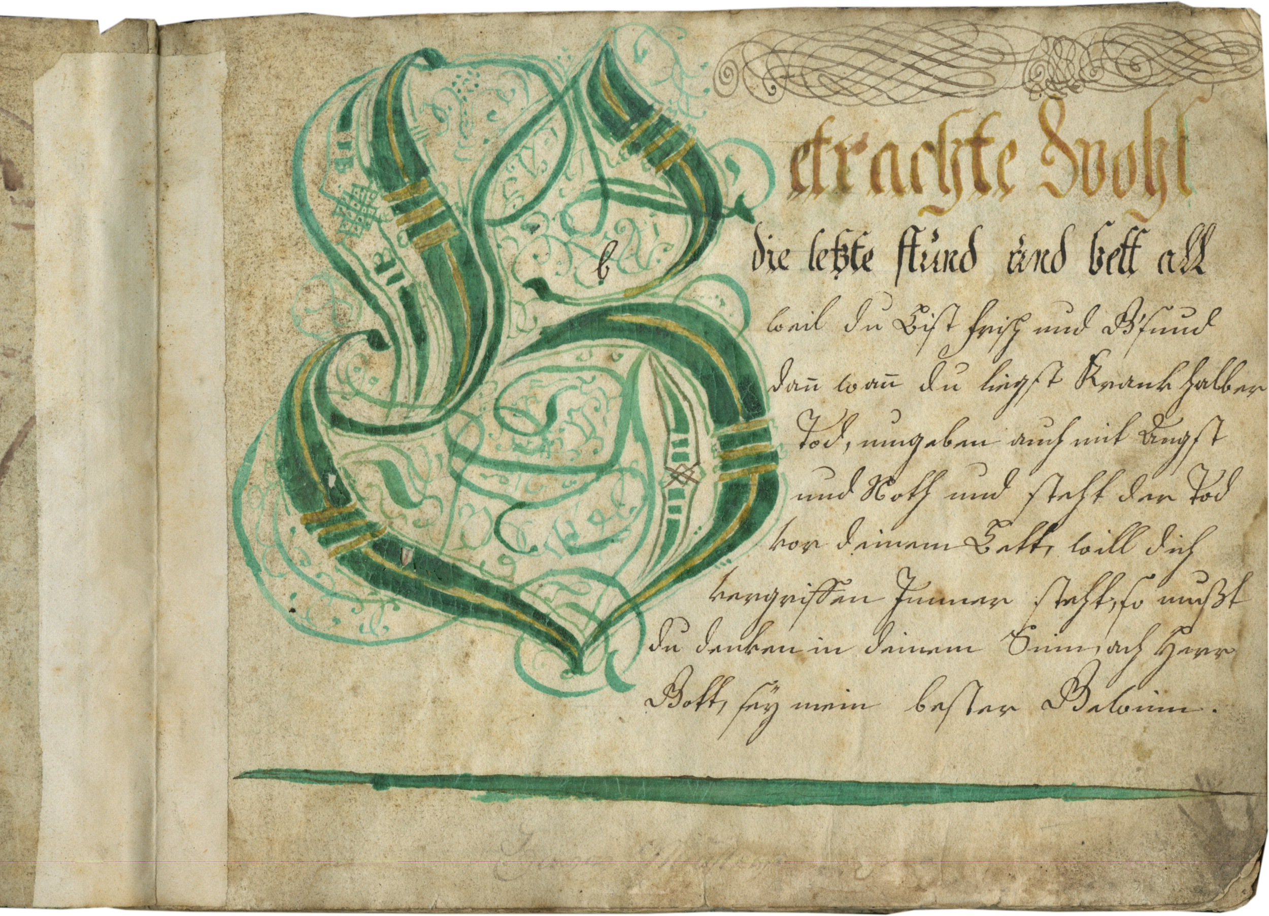
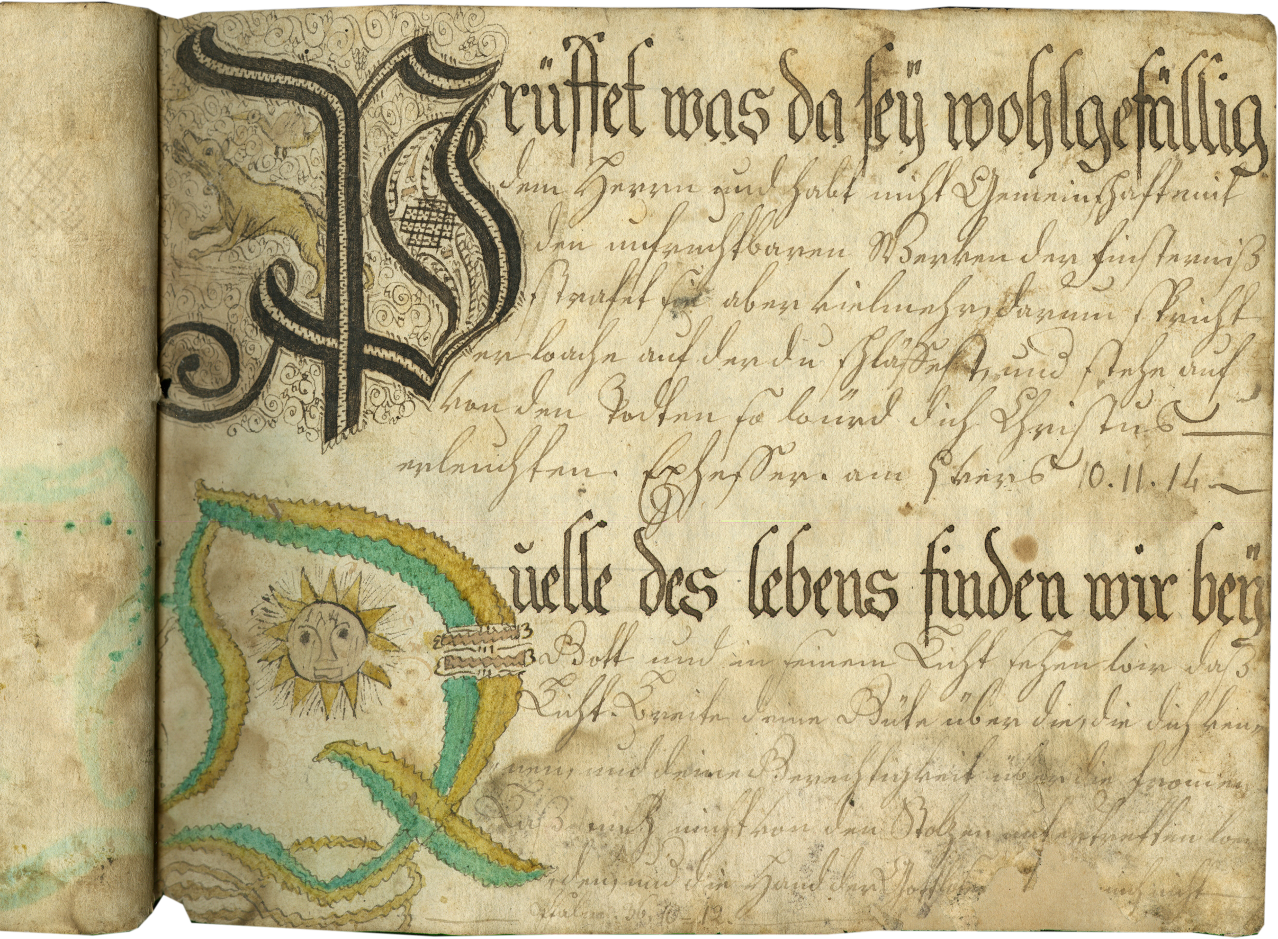
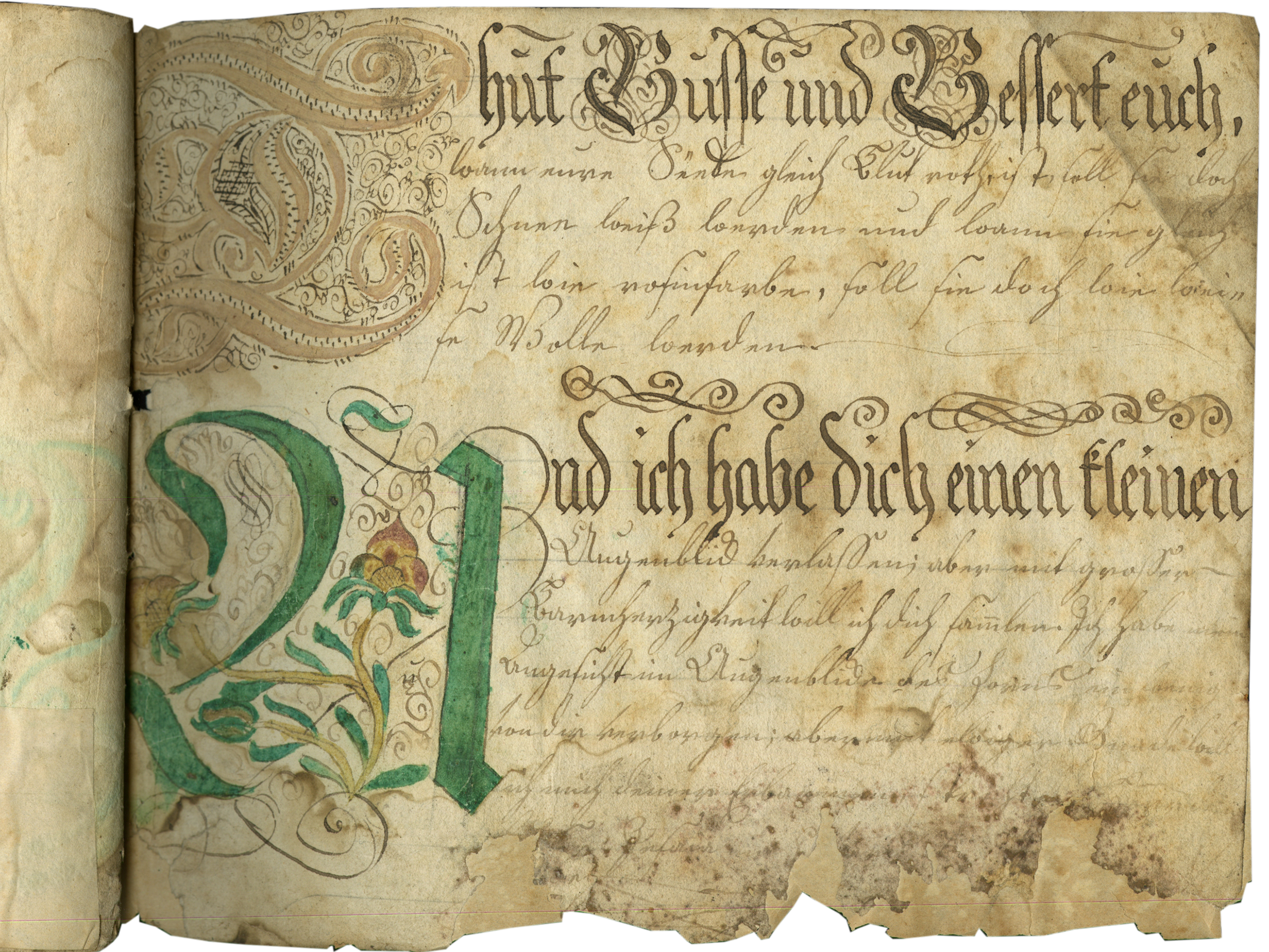
Writing-masters’s copy books served to teach students handwriting from the sixteenth century and into the modern era. Our calligraphic Alphabet Book, however, is a much rarer type of manuscript; it is a sample book made by a student eager to show off his or her skills. The large, highly flourished capitals washed with bright colors and adorning each page of our manuscript are clearly the focus here, rather than the much more amateurish script. The result is a delightful book, of interest for its place in the history of script and, equally, the history of educational practices in the eighteenth century.
1. This calligraphy sample book was created to show off the flamboyant capitals and formal writing skills of a student scribe, and we suggest that it likely dates from the late eighteenth century, c. 1780-1800 (we thank Dr. Marc Smith for his expertise).
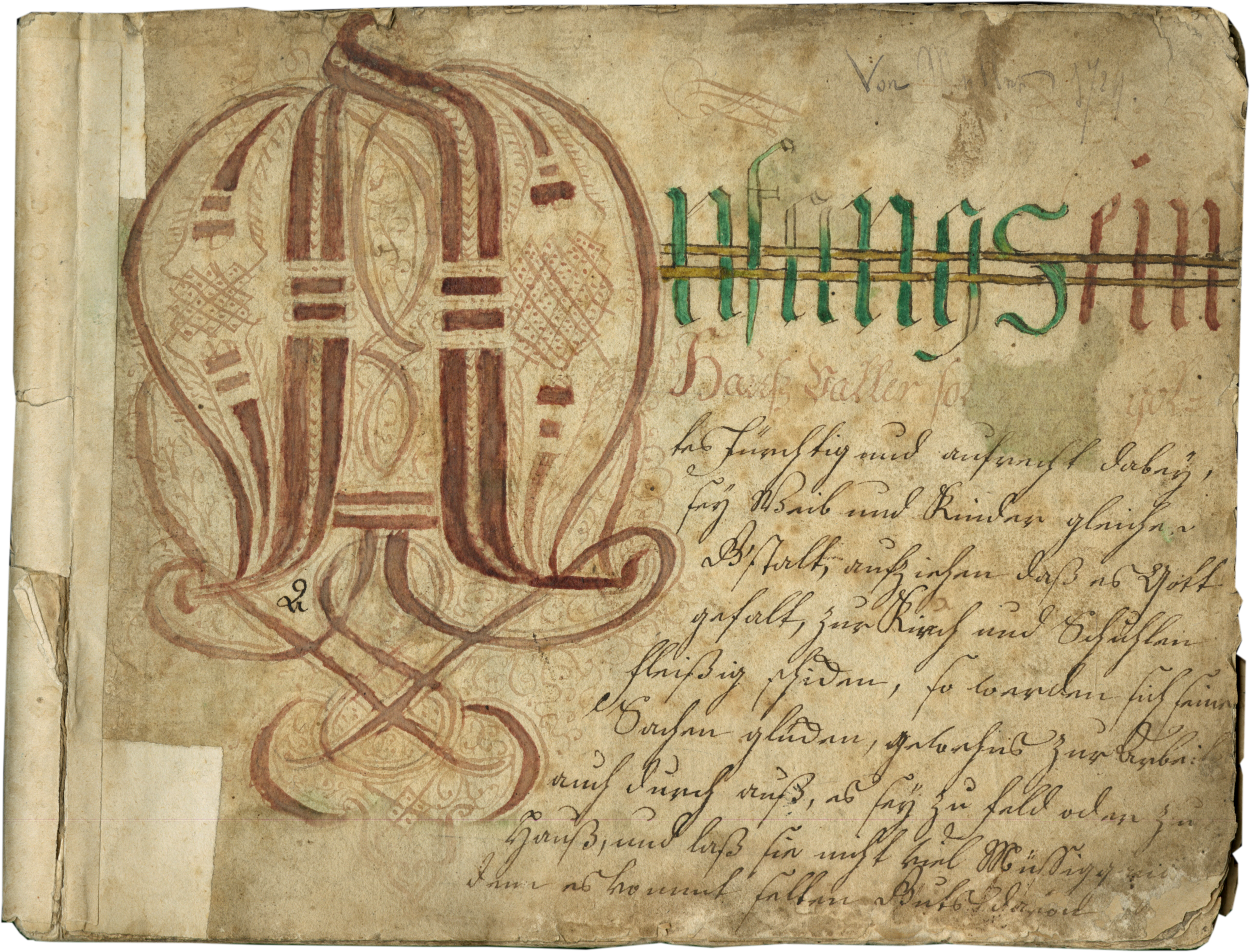
2. Written at the top of the first folio, “Von M<…?> 1<7>24,” now faint and difficult to decipher. “1724” may be a date, in which case this manuscript must date earlier than that. However, since this is not written in the hand or ink of the scribe, it seems unlikely to be the date of the manuscript. Instead, the symbol ‘7’ may possibly be ‘/’, suggesting this is a shelfmark or a price, instead of a date.
3. Private European collection.
Two alphabetical cycles:
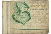
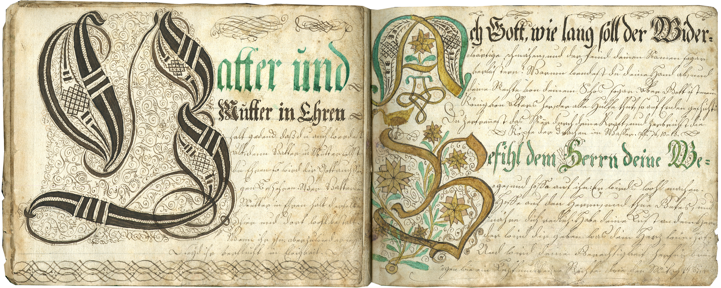
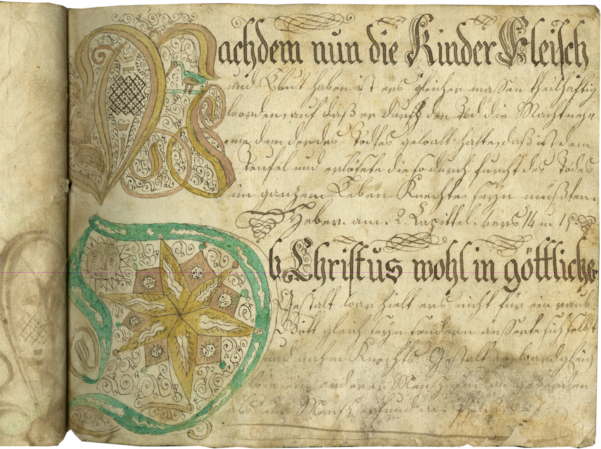
ff. 1-24v, Texts beginning with ‘A-Z’, intentionally omitting ‘J’ and possibly ‘U’, and lacking ‘R’, leaving the verso blank; ‘V’ is now out of order and glued onto the verso of f. 24, so it is the last letter in the series: ff. 1-24v, incipit, “Anfangs ein, …; [f. 2], Betrachte Wohl die letzte stnd und bett all …; [f. 3], Christus hat sein Creuz getragen damit …; [f. 4], David ein <Wachterer?> schäffers knab für Goliath …; [f. 5], Ehr jeder Mann nach standtes …; [f. 6], Fausentzen Ist ein schlimmer leben dem soll sich…; [f. 7], Gut willig biß in seinem …; [f. 8] Häußlich sollen seyn die …; [f. 9], In deiner Jugend, strab nach Tugend …; [f. 10], Keinem ietzt mehr zu Trauen ist …; [f. 11], Lieb deine Dochter nicht so …; [f. 12], Mit Trüh sahl leiden Angst und Noth …; [f. 13], Niemand kan Zweyen Herren dienen …; [f. 14], O mensch dein Nahmen hass in …; [f. 15], Peinlich und schwer der anfang …; [f. 16], Q …; <lacking ‘R’>; [f. 17], S…; [f. 18], ‘W’ and ‘X’ misbound, from second series], Wer will die Ausserwehlten …; Xandewe war vor alle Zeiten …; [f. 19], T…; [f. 20], W…; [f. 21], X…; [f. 22], Y …; [f. 23], Z …; [f. 24, blank; f. 24v, out of order, glued to verso], V …”;
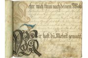
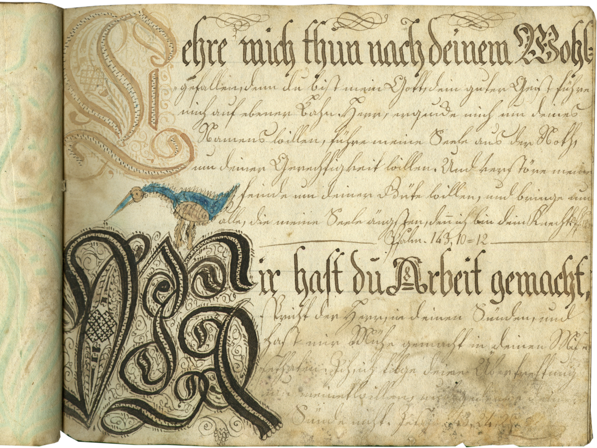
ff. 25-34, Texts beginning A-V (with ‘J’ and ‘V’, intentionally omitted, and missing ‘Y/Z’ ); two per page: ff. 25-34, incipit, Ach Gott wie lang soll…; Befihl dem Herrn …; [f. 26], C….; D….; [f. 27], E…; F….; [f. 28], G…; H…; [f. 29] I…; K…; [f. 30], L…; M…; [f. 31], N…; O…; f. 32, P…; Q…; f. 33, R…; S…; f. 34, T…; U…”; [‘W/X’, misbound, see f. 18, above; ‘Y/Z’, missing].
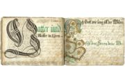
This calligraphy sample book was created to show off the formal writing skills of a student. Students learning handwriting studied under a writing master or taught themselves using a writing master’s alphabet or manual, which were popular throughout the early modern period (c. 1550-c.1800) in both Europe and the Americas. Our sample book is a particularly appealing example, since it is so clearly the work of an enthusiastic, but not very expert, calligrapher, who copied two alphabetical series in his or her book. The very large and decorative capital letters on each page (one per page in the first alphabetical series, and two per page in the second) are clearly the focus here, and they are both impressive and charming. Dominating the page (in the first series they occupy as much as one third of the page and can extend all the way from the top to the bottom), they were completed in different colors, often are adorned with ink scrolls, and they are quite well-executed. The first series of capitals may be based on models (see below); the second alphabetical series seems more imaginative, and often includes fanciful touches (for example, the little bird and sun with a face on f. 31, and the dog and sun within the initials on f. 32). Following the initial our student copied a short text; the source or sources for these texts have not been identified, but the contents suggest a collection of popular moral and religious maxims, with the first line in the first alphabetical series in a fraktur display script, usually colored, the second line, or the first line in the second series, in Kanzleischrift, and the remainder of text in the German cursive known as Kurrentschrift, or more colloquially “German Script.” Our student was a more successful artist than calligrapher, and the rather inexpert character of the script contrasts with the very careful and elaborate capitals.
This book is clearly following the tradition of the German writing masters who particularly loved extremely flourished capitals, which can be seen already in Ein gute Ordnung by the famous German writing master Johann Neudörffer (1497-1563), known as “the father of German calligraphy.” The extremely elaborate capitals included in Anton Neudörffer’s 1601 reissue of his grandfather’s Ein Gesprechbüchlein zweyer schüler, wie einer den andern im zierlichen schreyben untherweyst seem similar enough that they could even have been used by our student as a model for the first alphabetical series, although perhaps not directly (Reed, 2019, Online Resources). The alphabets in the calligraphy specimens following the writing manual by Adolph Zunner in a German manuscript, c. 1713 (formerly Les Enluminures, TM 1007), and in Zunner’s printed copybook (Zunner, 1709), may also be compared with those in our manuscript. Adolph Zunner (known activity c. 1696-1752) was a Nuremberg writing and math teacher (Doede, 1958, pp. 79 and 83).
The scripts used include three of the basic scripts taught in Germany in the eighteenth century. German students would learn the ‘Latin’ block letters and cursive, and then the so-called ‘Deutsche Schrift,’ including Fraktur and Kurrent (Herrmann, 2015, Online Resources), and, as seen in this book, sometimes Canzley or Kanzleischrift (Chancery script) with its older, Gothic elements (Nesbitt, 1957, pp. 117-18). In Europe these scripts were practiced strictly in the German territories of the Austro-Hungarian Empire, but they experienced considerable reach and longevity among German-speaking colonists in the New World (Whalley 1980, p. 243).
Doede, Werner. Bibliographie deutscher Schreibmeisterbücher von Neudörffer bis 1800, Hamburg, 1958.
Nesbitt, Alexander. The History and Technique of Lettering, Mineola, New York, 1957.
Sprenger, Kai-Michael. Zug um Zug: Die Schreibmeister und ihre Kunst vom 16. bis zum 19. Jahrhundert, Mainz, 1998.
Whalley, Joyce Irene. The Pen’s Excellencie: Calligraphy of Western Europe and America, London, 1980.
Zunner, Adolph. Kunstrichtige Schreib-Art, welche allerley Teutsche Current- Canzley- Fractur- und auch Lateinische Schrifften…, Nuremburg: Christoph Weigel, 1709. Available online:
Bibliothèque nationale de France, département Estampes et photographie, 4-KB-43, at ark:/12148/btv1b10550838f
Herrmann, Ralf, “Kurrent—500 years of German handwriting,” Typography.guru, February 21, 2015
https://typography.guru/journal/kurrent—500-years-of-german-handwriting-r38/
Calligraphy Specimens following Writing Manual by Adolph Zunner[?]; Formerly, Les Enluminures, TM 1007
https://www.textmanuscripts.com/medieval/calligraphy-specimen-141377
Susan Reed, “‘The Father of German Calligraphy’: Johann Neudörffer,” June 13, 2019
https://blogs.bl.uk/european/2019/06/the-father-of-german-calligraphy-johann-neud%C3%B6rffer.html
TM 1121

